Customizing a Component
Customize the styling of a component by using design tokens that align with your store's branding.
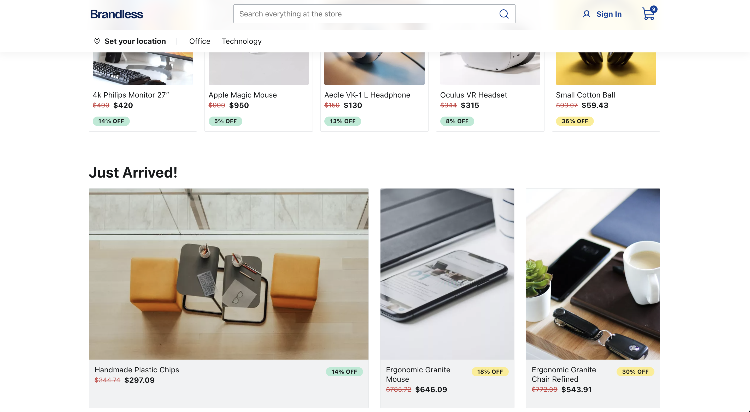
In this guide, you'll learn how to customize the style of a FastStore component using its local tokens. For the sake of this tutorial, We will use the Listing variant from the Price Component.
This is how Prices looks like in our current homepage (with the default color black) :

Remember that when changing a component's style, you can use Global tokens or styling from scratch using your preferred styling tool. However, changing the value of a global token may affect different parts of your store's interface.
- In your
custom-theme.scsstheme file , add thedata-fs-priceanddata-fs-price-variantdata attributes with theListingvalue:
  ...
  // --------------------------------------------------------
  // FS UI Components
  // --------------------------------------------------------
  // Add here the customizations for FastStore UI components.
[data-fs-price] {}Each FastStore UI component has a list of data attributes that can be used for further customization. You can find it in the component's Customization section.
- Now, change the color of the
Listingvariant using thePricelocal token. For this tutorial, we will use the shade of red#cb4242:
  ...
  // --------------------------------------------------------
  // FS UI Components
  // --------------------------------------------------------
    [data-fs-price] {
      --fs-price-listing-color: #cb4242;
}- Save your changes and check your browser to see the new color of your listing price. You may need to refresh the page.
Since we are not specifying the Price component context, we are applying this change to all the Price (data-fs-price) occurrences where the variant is listing.
If you want to apply this change in only one store component, follow the next step Customizing a component within a section.
Customizing a component within a section
The starter provides a set of native sections, each consisting of different components with unique functionalities. You can customize the components inside its section using the available section and the component's data attributes.
In the example below, we will change the color of the Price component with the listing variant.
But we only want to apply this change in the ProductShelf section. So, we can use the data-fs-product-shelf data-attribute to select the ProductShelf component in this section.
- In your
custom-theme.scsstheme file , add the following code:
  ...
  // --------------------------------------------------------
  // FS UI Components
  // --------------------------------------------------------
  [data-fs-price] {
    --fs-price-listing-color: #cb4242;
  }
  [data-fs-product-shelf]{
    [data-fs-price][data-fs-price-variant="listing"] {
      background-color: var(--fs-color-warning-bkg);
    }
}- Save your changes and check your browser to see a yellow background color added to listing prices inside the
ProductShelf. You may need to refresh the page.
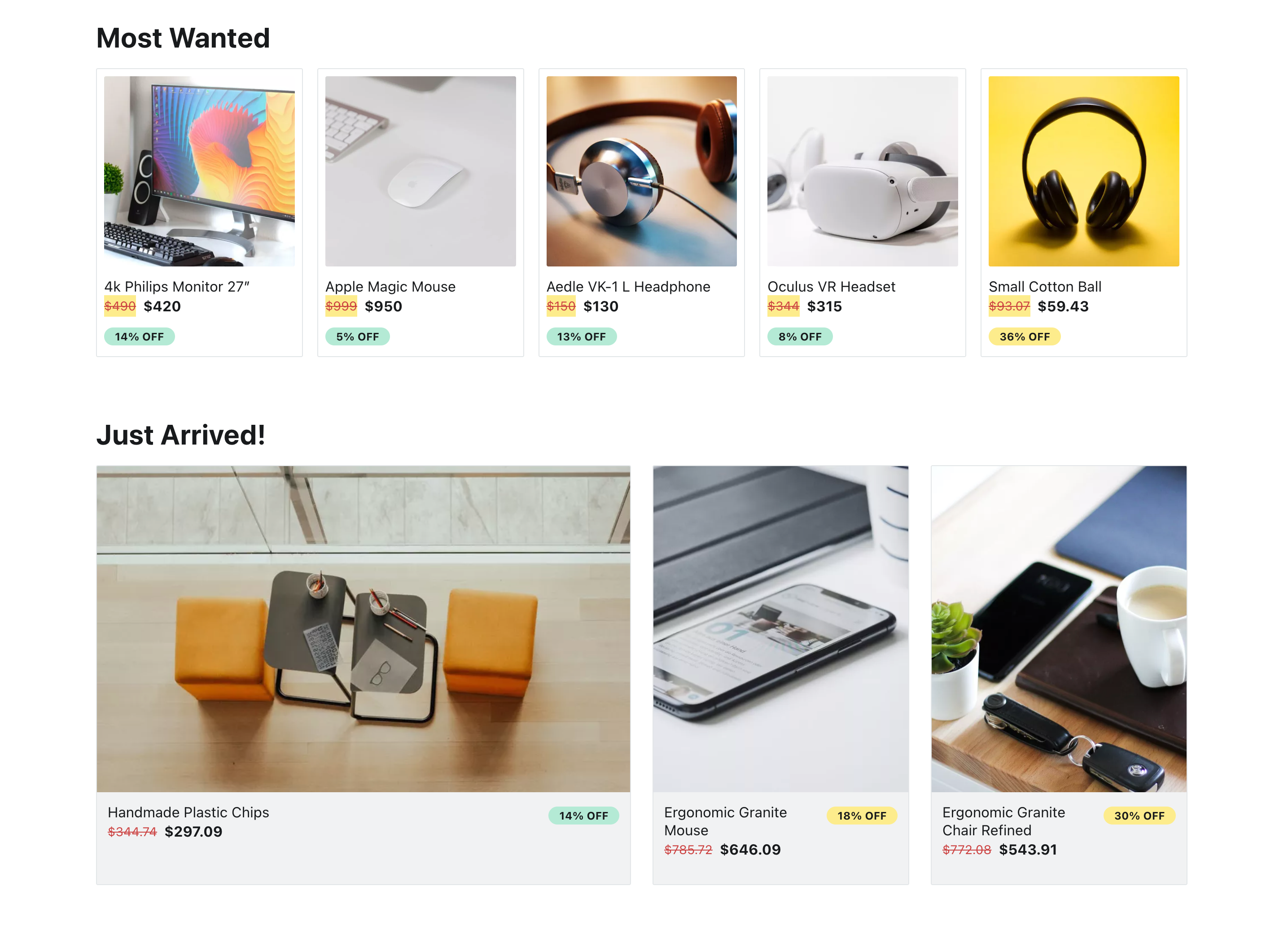
Notice that in this example, only one section received the change, the ProductShelf. You can use this same approach whenever you need to syle FastStore UI Components.
Customizing a new component when using override
To customize a native component in FastStore to suit your store's needs, you can use the override feature. When overriding a native component and using your custom component, you may need to style it from scratch. In this section, you'll learn how to style a custom component.
Before you start
Make sure you have a basic understanding of overriding native components and props. Additionally, we recommend to use CSS Module (opens in a new tab) for styling your new component.
FastStore components support Sass (opens in a new tab) for styling by default, but you can work with your desired tool.
For better understanding, we will use the example from the Overriding Native Components and Props guide.
This example demonstrates how to create a new BuyButton, the CustomBuyButton in the ProductDetails section.
To follow along this section, make sure to create the CustomBuyButton.
Step by step
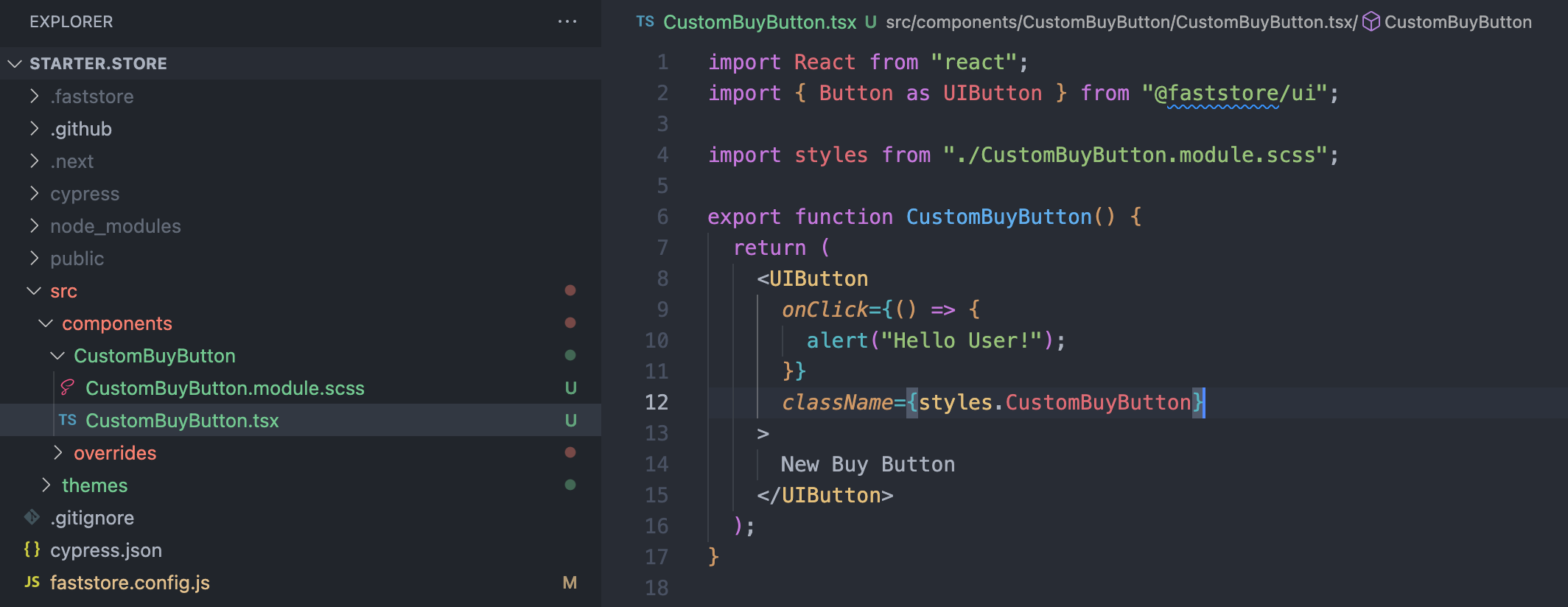
- Once you have created the
CustomBuyButtoncomponent, create a new file calledCustomBuyButtons.module.scss.
- Add the following code to the
CustomBuyButtons.module.scssfile:
.CustomBuyButton {
  --fs-button-border-radius: var(--fs-border-radius-pill);
  --fs-button-padding:  0 var(--fs-spacing-5);

  color: var(--fs-color-text-inverse);

  [data-fs-button-wrapper] {
    background-color: #E31C58;
  }
}You can use FastStore UI components' customization data attribute to ease your styling process. In this example, we used data-fs-button-wrapper.
To ensure visual consistency with your store's theme, we highly recommend utilizing the global tokens whenever possible. Also, you can take advantage of the design tokens set provided by FastStore UI Components.
- Restart the server and check the color and shape of your
CustomBuyButtoncomponent: